MuseumSRV
Brand identity for a regional history museum.
Brand identity for a regional history museum.
Brand identity for a regional history museum.
We transformed the museum's perception from an old-timey historical society to a contemporary museum, a fun and inviting place for young families to learn about the history of the San Ramon Valley.
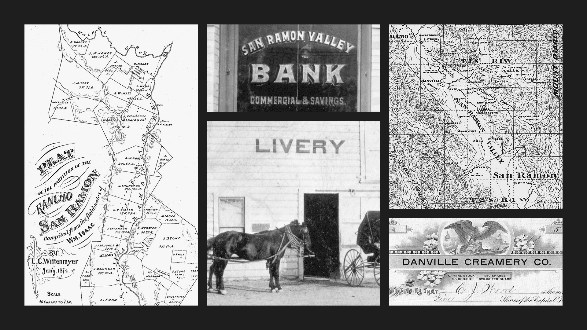
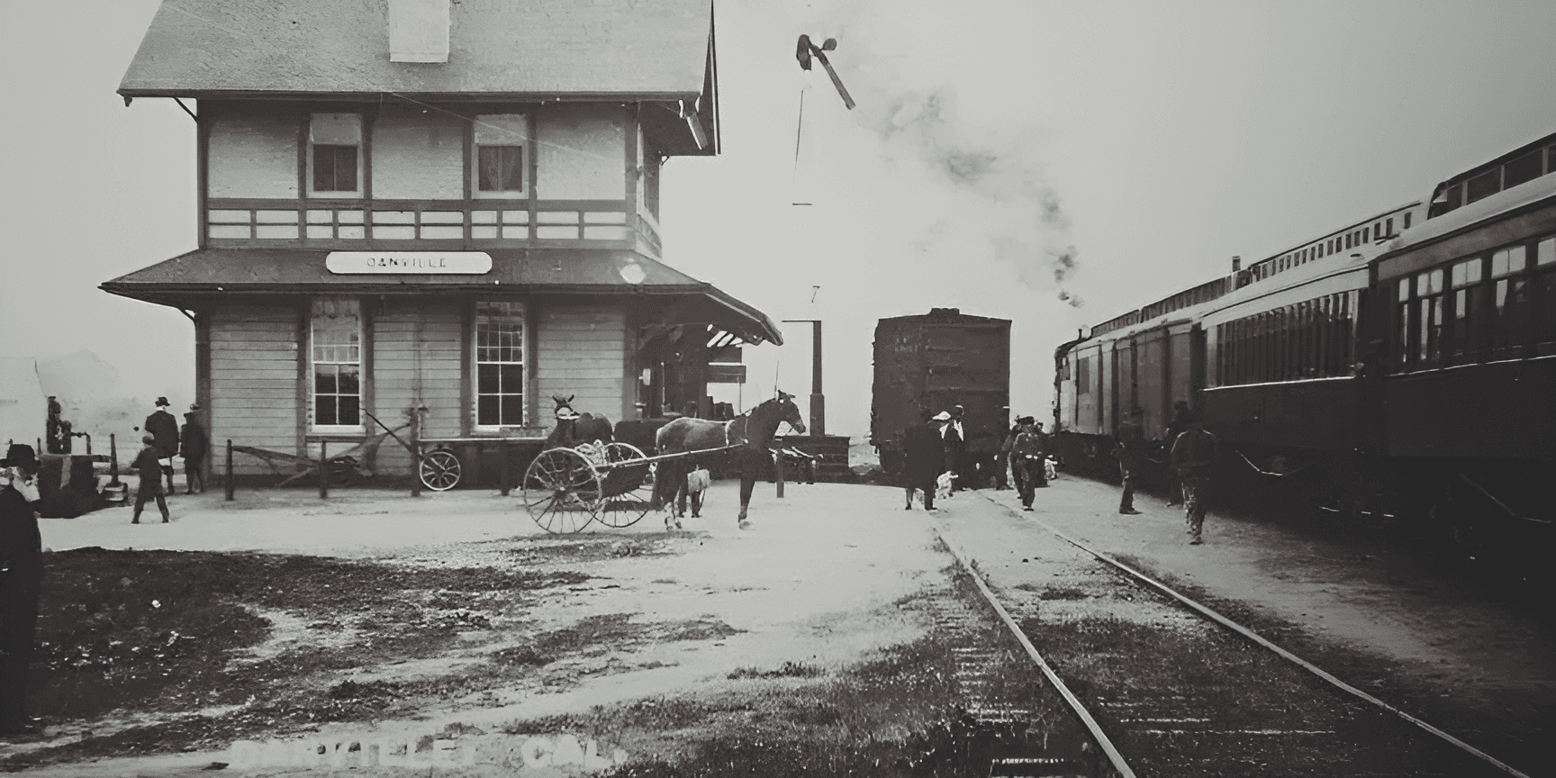
The museum lives in a former Southern Pacific Train Depot built in 1891. The identity represents the convergence of the railroad and the wagon wheel, key forces that ignited the region's growth in the late 19th century.

We brought everything—exhibits, events, fundraisers, and more—under one cohesive system, so the museum finally spoke with a clear and distinct voice.


Project Info
MuseumSRV
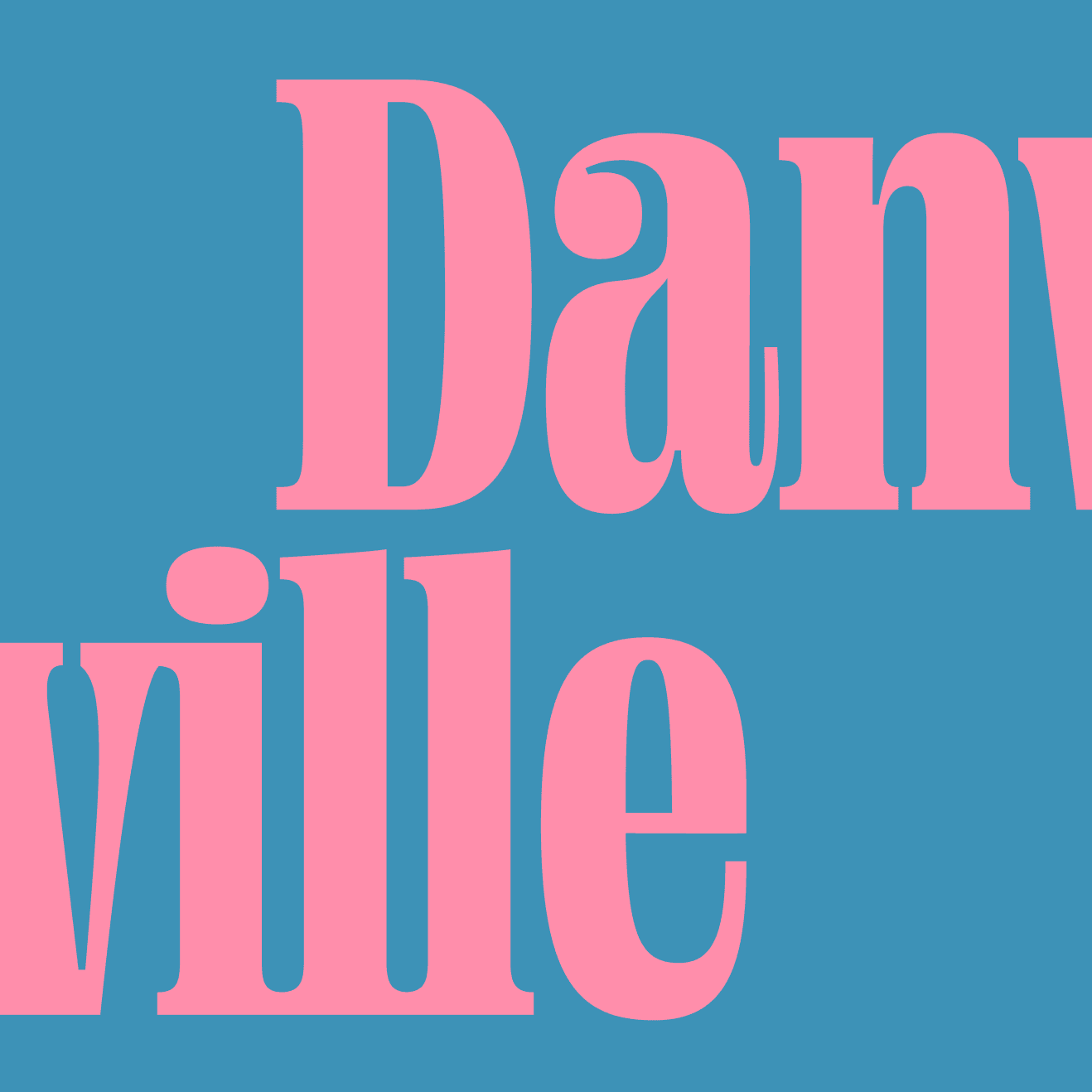
Danville, California
When The Museum of the San Ramon Valley approached us, it was ready for a new era. Tucked inside a former 1891 Southern Pacific train depot, its identity had long been shaped by model train exhibits and old-timey nostalgia. But its Board of Directors wanted to redefine the museum as a contemporary, cultural hub that would appeal to the young and diverse families of today's San Ramon Valley.
Our first step was to speak with families, teachers, civic leaders, and even the loyal train enthusiasts. What emerged was a clear tension: people valued the museum’s roots, but didn’t see themselves in it. Younger families wanted engaging experiences. Longtime members and docents wanted continuity. Everyone wanted more than just “preservation”—they wanted participation.
From this, the brand idea emerged: History, alive. In order to appeal to a younger crowd, the museum needed to make the Valley's history engaging, exciting, and dare we say, fun.
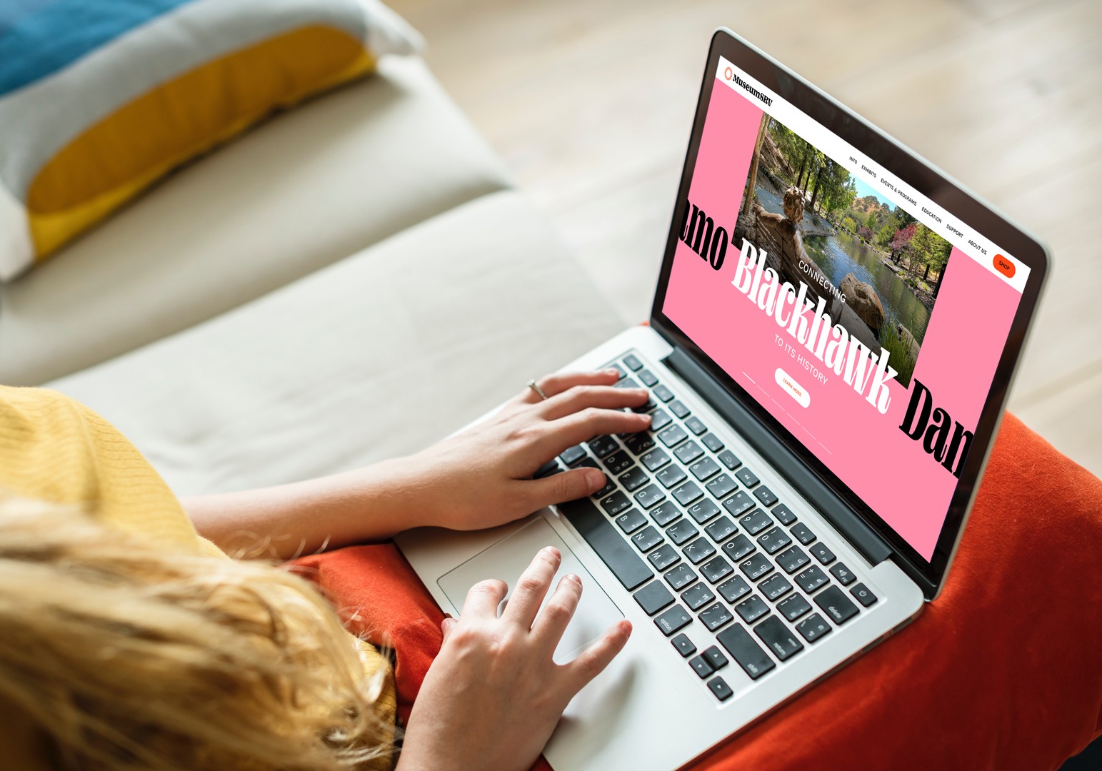
We renamed the institution MuseumSRV. Shorter. Stronger. More contemporary.
Visually, we created a logo that symbolizes convergence—a fusion of the railroad and the wagon wheel, two forces that shaped the Valley’s history. The new identity helps the museum speak to both the history buffs and the curious kids, the longtime residents and the newcomers.
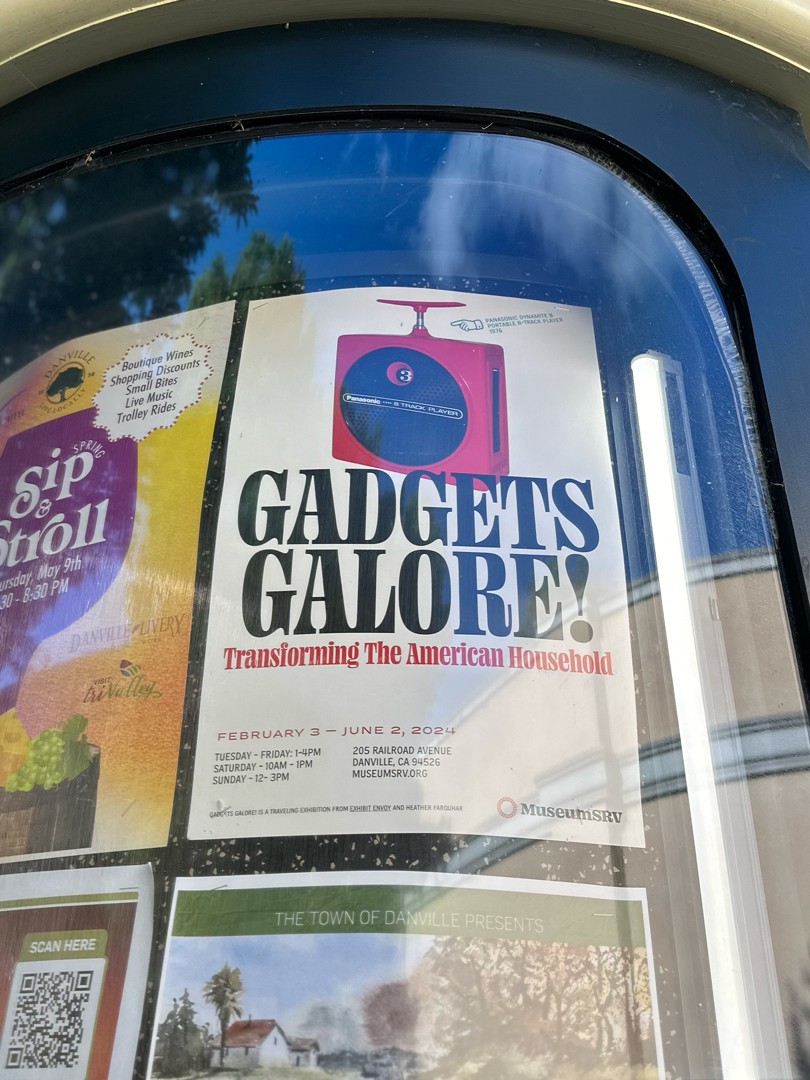
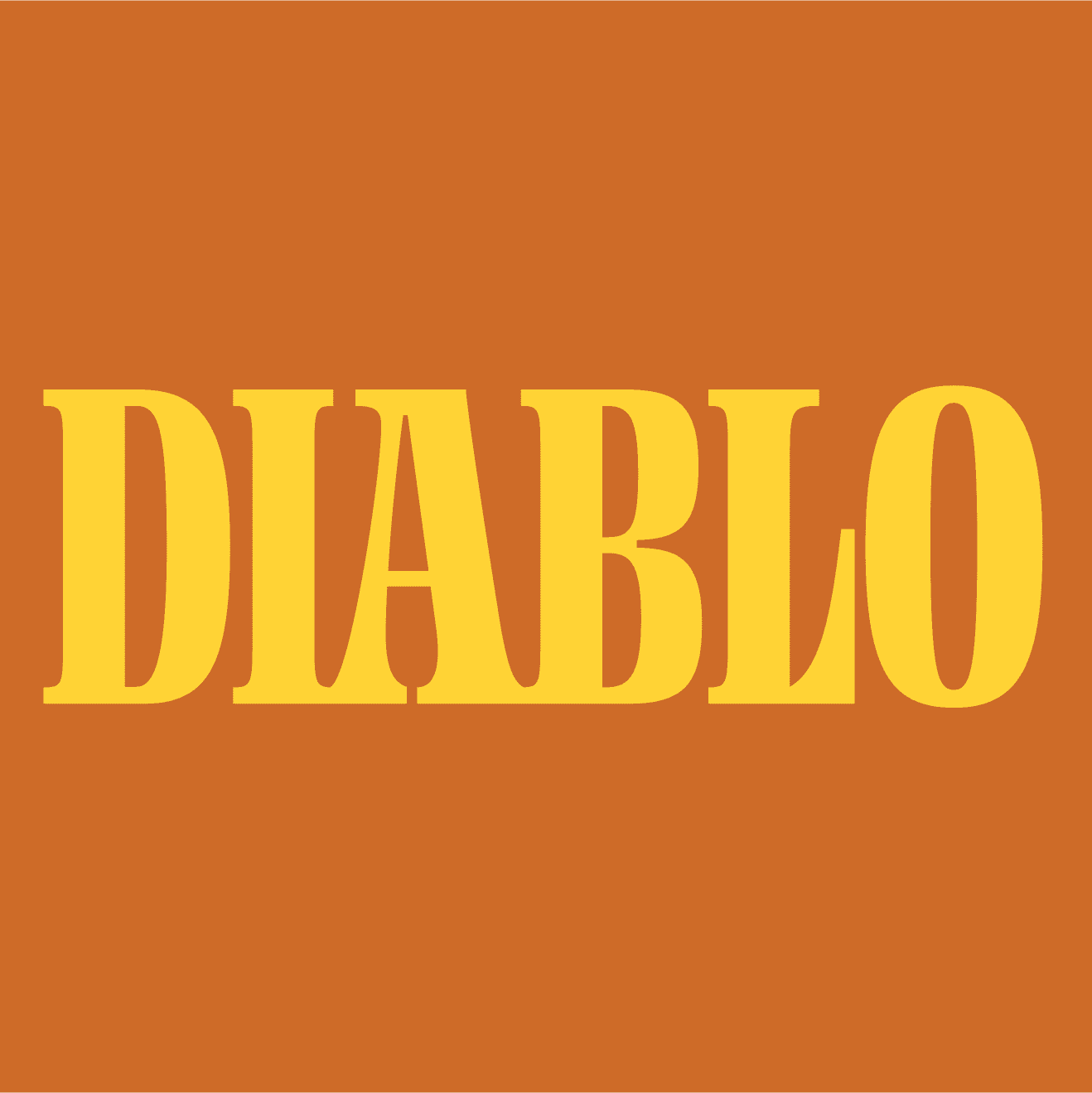
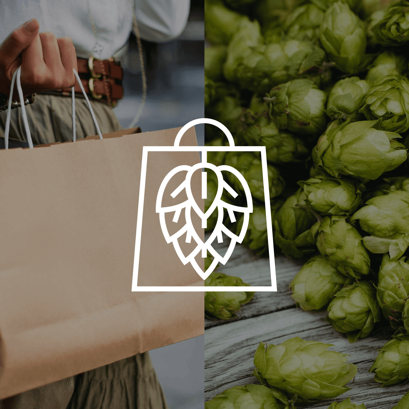
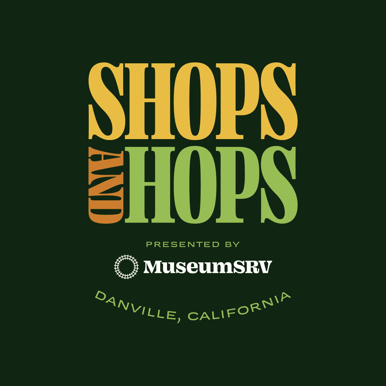
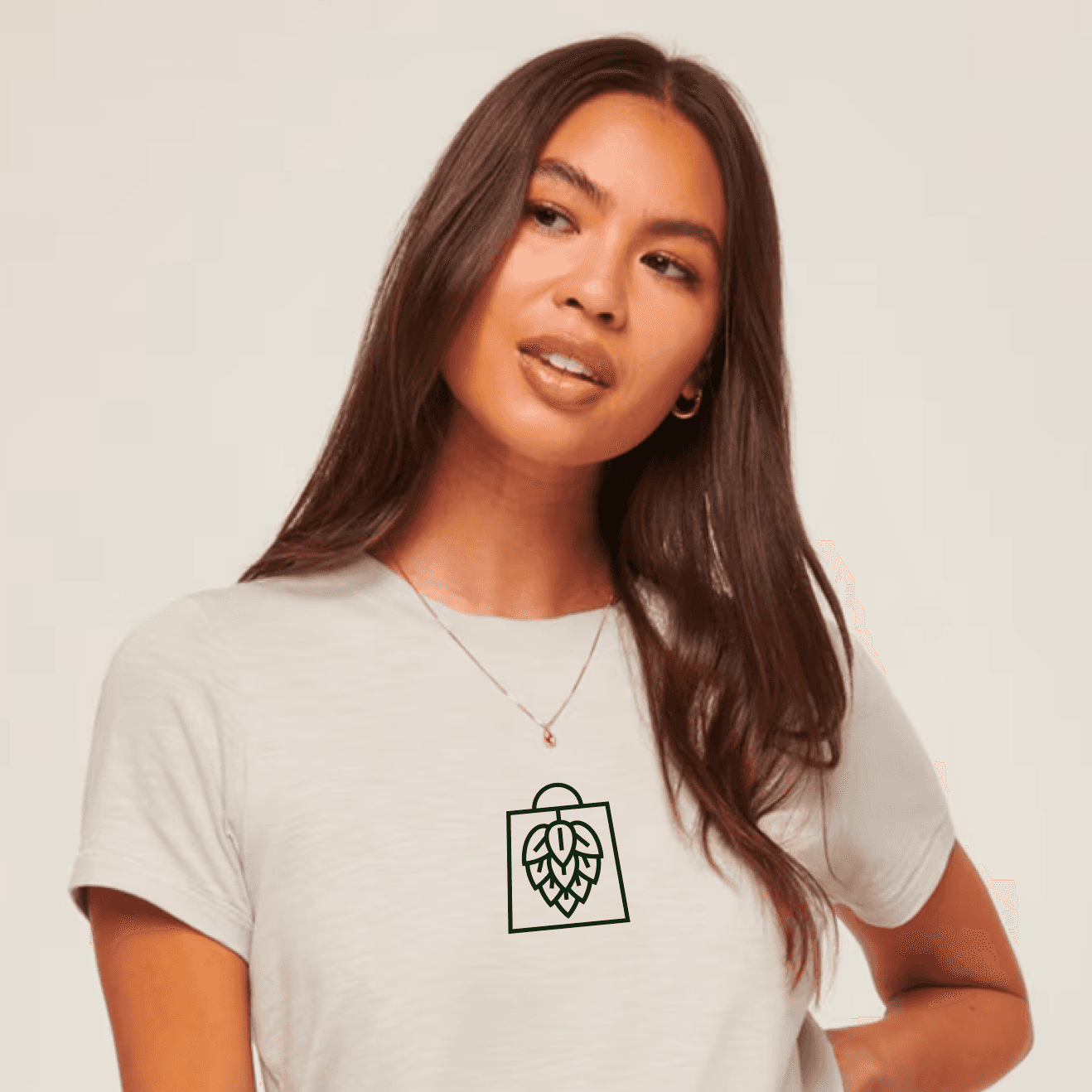
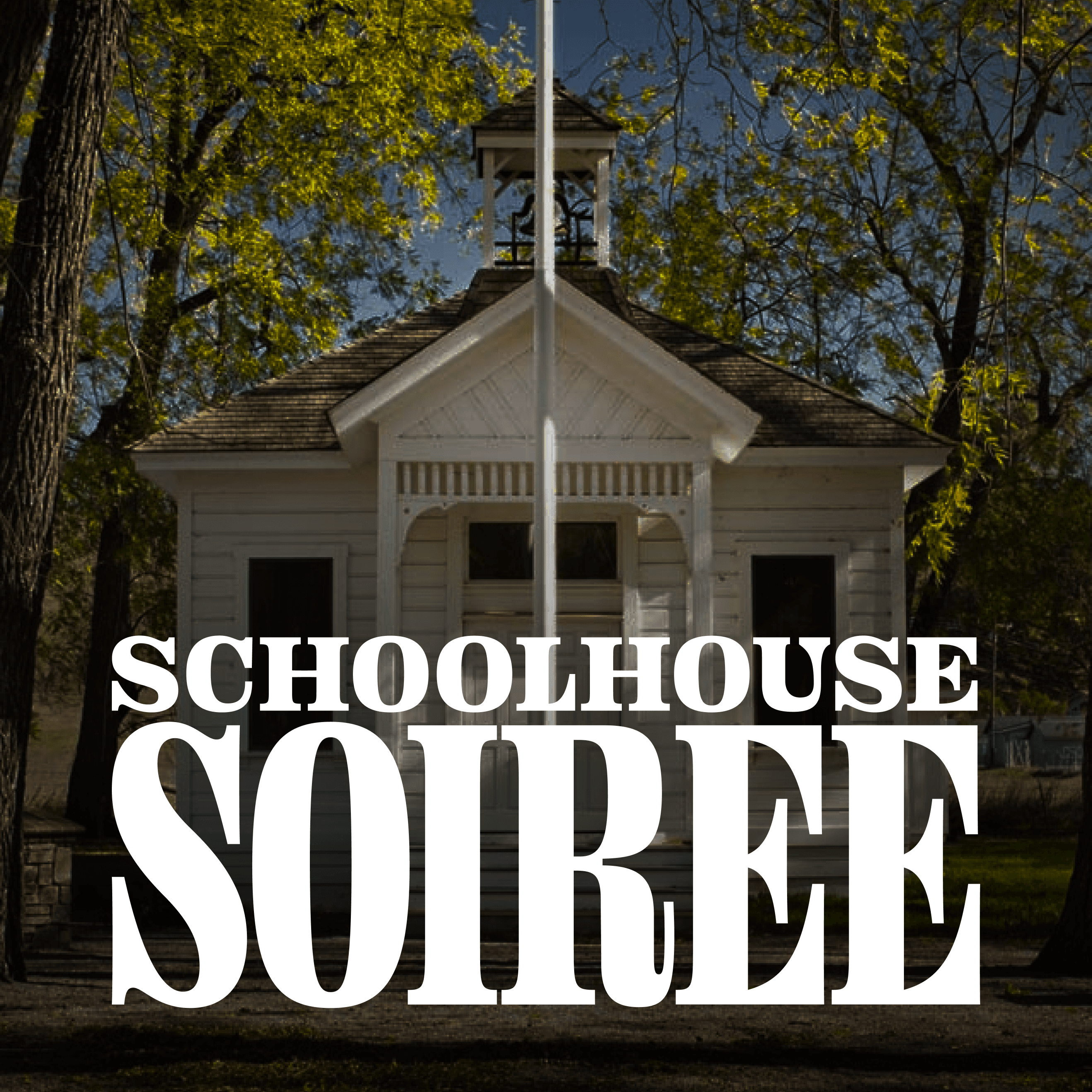
The design system pushed further. The palette is inspired by the Valley itself—sun, earth, sky, grass, and gold—bright, warm, and approachable. The charismatic typography is centered around modern throwbacks Fatface and Compadre by Ohno Type Co., the world-renown foundry located just 30 minutes from the museum in San Jose. We used type and color to bring life to everything: from exhibit identities (Gadgets Galore! and Totally Trains) to events like Shops & Hops, an annual beer stroll hosted by local businesses, and the Schoolhouse Soirée, a fundraising dinner hosted at the one-room Tassajara Schoolhouse built in 1889.
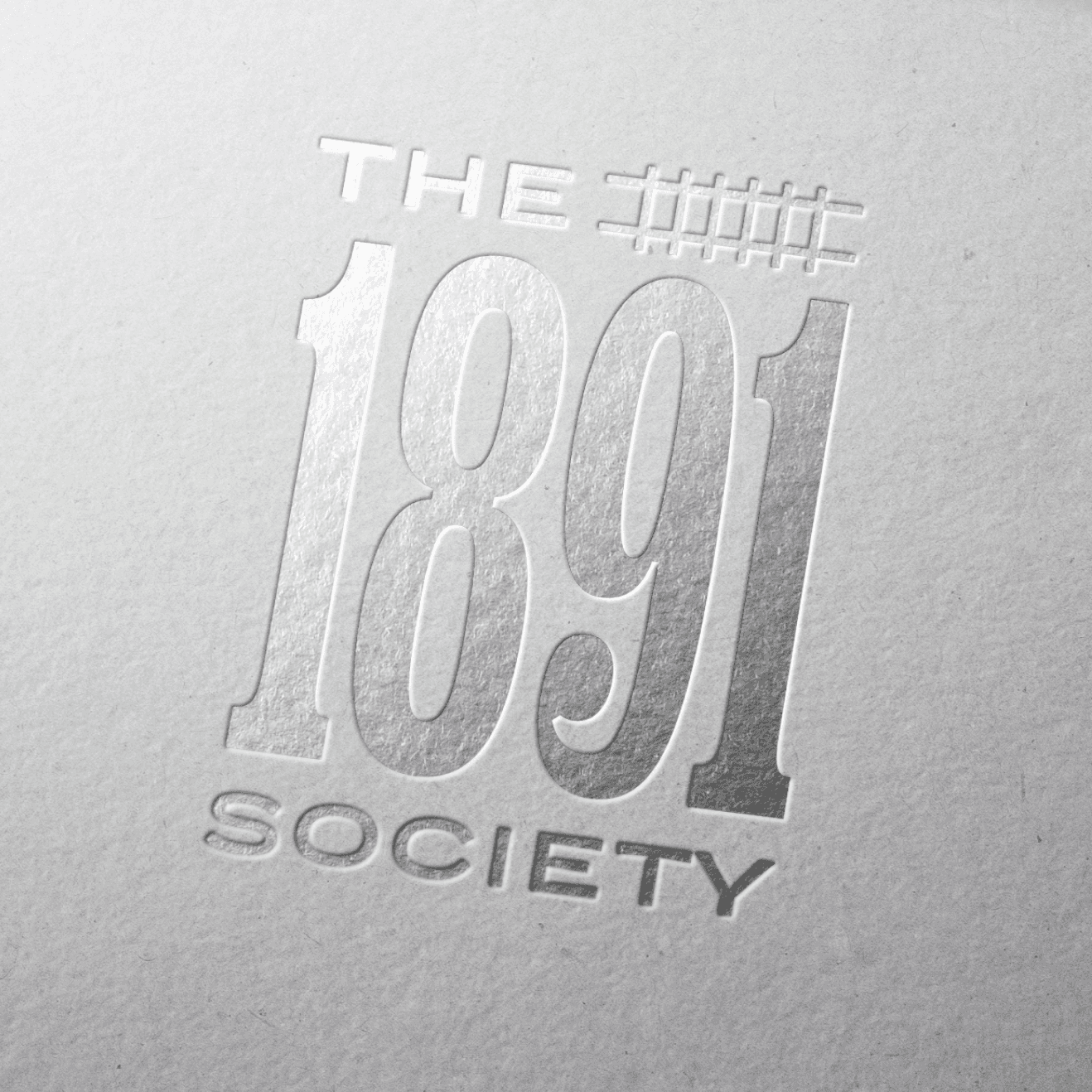
We also helped shape the museum's quarterly newsletter, The Branch Line, as well as The 1891 Society—a select group of extra-generous donors who share the museum's long view of legacy and impact.
The transformation has been more than visual. Foot traffic and event attendance has grown. Younger families are showing up. Local partnerships are expanding. Donor conversations are deeper. As MuseumSRV continues to grow, their story is proof you don’t have to abandon your past to be part of the future.
Client Partners
Mary Frandsen, John Keenan, Carmen Curtis, Dan Dunn
Project Info
MuseumSRV
Danville, California
When The Museum of the San Ramon Valley approached us, it was ready for a new era. Tucked inside a former 1891 Southern Pacific train depot, its identity had long been shaped by model train exhibits and old-timey nostalgia. But its Board of Directors wanted to redefine the museum as a contemporary, cultural hub that would appeal to the young and diverse families of today's San Ramon Valley.
Our first step was to speak with families, teachers, civic leaders, and even the loyal train enthusiasts. What emerged was a clear tension: people valued the museum’s roots, but didn’t see themselves in it. Younger families wanted engaging experiences. Longtime members and docents wanted continuity. Everyone wanted more than just “preservation”—they wanted participation.
From this, the brand idea emerged: History, alive. In order to appeal to a younger crowd, the museum needed to make the Valley's history engaging, exciting, and dare we say, fun.
We renamed the institution MuseumSRV. Shorter. Stronger. More contemporary.
Visually, we created a logo that symbolizes convergence—a fusion of the railroad and the wagon wheel, two forces that shaped the Valley’s history. The new identity helps the museum speak to both the history buffs and the curious kids, the longtime residents and the newcomers.
The design system pushed further. The palette is inspired by the Valley itself—sun, earth, sky, grass, and gold—bright, warm, and approachable. The charismatic typography is centered around modern throwbacks Fatface and Compadre by Ohno Type Co., the world-renown foundry located just 30 minutes from the museum in San Jose. We used type and color to bring life to everything: from exhibit identities (Gadgets Galore! and Totally Trains) to events like Shops & Hops, an annual beer stroll hosted by local businesses, and the Schoolhouse Soirée, a fundraising dinner hosted at the one-room Tassajara Schoolhouse built in 1889.
We also helped shape the museum's quarterly newsletter, The Branch Line, as well as The 1891 Society—a select group of extra-generous donors who share the museum's long view of legacy and impact.
The transformation has been more than visual. Foot traffic and event attendance has grown. Younger families are showing up. Local partnerships are expanding. Donor conversations are deeper. As MuseumSRV continues to grow, their story is proof you don’t have to abandon your past to be part of the future.
Client Partners
Mary Frandsen, John Keenan, Carmen Curtis, Dan Dunn


