Leep
Brand identity for the UK-based sleep tech company.
Brand identity for the UK-based sleep tech company.
Brand identity for the UK-based sleep tech company.
We helped Leep develop their brand story and identity with a strategy built on the founder's dream—to bring better sleep to everyone, not just the affluent.
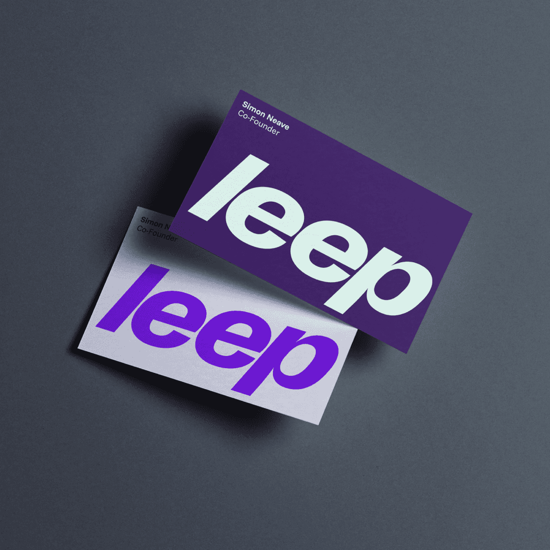
The new identity is accessible, youthful and fun. The simplicity, boldness and forward-motion of the core elements signal a leap of progress for your health habits.
The brand's personality is more like a friend than a medical device.


Project Info
Leep Health
London, United Kingdom
When Leep first came to us, they had an ambitious mission: to make the science of better sleep accessible to everyone. They were entering the crowded wearable health tech category where most competitors lean into exclusivity. Sleep trackers often feel like jewelry for the affluent or have overly complex apps designed for the hyper-motivated. But Leep had a different audience in mind: younger, health-conscious people who couldn’t afford a $400 ring or a personal sleep coach, but who cared deeply about feeling better.
Our challenge was to help Leep stand apart in a saturated market while capturing this overlooked, underserved audience.
First, we helped crystallize the why (maximize mental and physical wellness for all), the how (tech that builds healthy habits) and the what (badass wearables with character). Mapping the tone, pricing, and positioning of leading players, we found an opportunity to emphasize quality, performance and affordability.
Additionally, we leaned into the truth that building healthy habits can be difficult for most people. Everyone knows sleep matters, but turning knowledge into consistent action is another story. This drove our core brand idea — “Small habits. Giant leaps.” A rallying cry that positions Leep not as just another activity tracker, but as a partner helping you turn small wins into lasting transformation.
As we refined our creative concepts, Leep’s voice began to sharpen—youthful, frank, and culturally aware. Where other brands lean on jargon, Leep speaks more directly: “Running on four hours of sleep isn’t a flex, it’s a crisis.” This tone of voice gives the brand credibility with a younger audience tired of polished platitudes.
Visually, the system breaks away from soft, warm neutrals and hyper-tech gloss. Leep’s identity is vibrant and energetic. It's driven by a night-inspired palette with electric accents, expressive typography (Right Grotesk Compact by Pangram Pangram and Funnel Sans by NORD ID) and raw, relatable photography.
By the end of the process, we delivered a comprehensive system: strategy, narrative, verbal and visual identity, and a style guide that codified everything from values and messaging to product naming and imagery.
The work aligned the founding team around a common philosophy and gave them a practical toolkit to enter the market with clarity and confidence. Leep's purpose-driven approach reframes sleep, and all its infinite benefits, not as a luxury but as a right.
Client Partners
Simon Neave, Adam Bailey, Martin Ashby
Digital Experience Partners
Thomas Moeller and Kalpesh Rathod, ZeroSixty
Senior Designer
Phillip Mitchell
Accolades
Best of Behance, March 2026


