Ping
Brand identity for the data superintelligence company in the insurance industry.
Brand identity for the data superintelligence company in the insurance industry.
Brand identity for the data superintelligence company in the insurance industry.

We helped shift Ping's story from a workflow efficiency tool for underwriters to the data infrastructure of the entire insurance industry.
Through this new lens, we designed an identity in constant motion—always building and evolving. It creates structure where there was none and moves the industry forward, piece by piece.
The design system extends the visual language of modularity and momentum throughout the ecosystem.


Project Info
Ping Data Intelligence
Miami, Florida
When Ping came to us they were known primarily as a tool for underwriters. But they had developed something far more potent: a modular, AI-powered data platform that could clean, process, and structure exposure data in seconds. But their brand still told a small story, one rooted in features and functions for a narrow slice of the market.
They needed more than a new look. They needed to reposition themselves as something larger.
We began by immersing ourselves into the world of Ping’s users: brokers, underwriters, MGAs, and carriers across the U.S. and U.K. These were highly credentialed professionals, often leading digital transformation initiatives with caution, not zeal. What they wanted wasn’t disruption—it was clarity, speed, and confidence in a world overwhelmed by data.
We mapped their frustrations. For brokers, it was the inefficiency of legacy workflows. For underwriters, the noise of unstructured data. What united them was a shared desire: to work smarter and faster without disturbing workflows.
Next, we audited the competitive landscape. Using our custom-built GPT, we leveraged AI to analyze the InsurTech 100, the world's 100 most innovative insurance technology companies. What we found was a field of visual and verbal familiarity: formulaic sans-serif logos, safe blues and greens, vague talk of “intelligence” and “solutions.” It was clear that if Ping was going to rise above, it needed to look and sound like a company building something bigger.
Through research and collaborative workshops, a single core truth emerged that drove the strategy:
The promise of innovation in a single leap is scary and threatens disruption to existing workflows. Realistic innovation builds momentum through steady, manageable steps. Ping’s modular solutions collectively form the new infrastructure that enables meaningful innovation at any stage of a client's transformation.
Rather than retrofit the brand around disconnected products, we positioned Ping as something fundamentally different: the infrastructure that makes innovation possible. Not the shiny new thing, but the essential platform underneath it all.
We called it "Infrastructure for Innovation."
On this foundational brand idea, we crafted a narrative that invited the entire industry into a shared future. While others were building faster cars, Ping was laying the highway. It wasn’t just about making a few processes work better, it was about making a better industry possible.
This message of empowerment—of being the force behind transformation, not the face of it—resonated deeply with Ping’s team. It clarified not only how they saw themselves, but how they spoke to their customers.
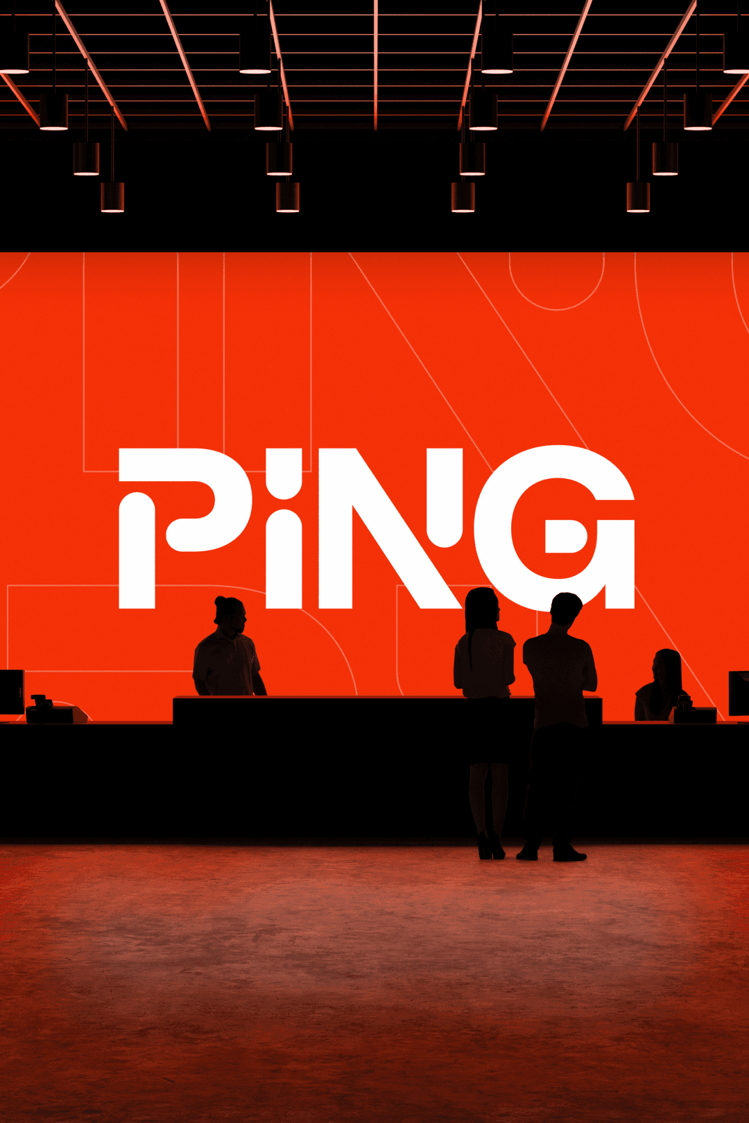
Visually, we reflected this strategy with a system that communicates structured modularity. The Ping logo embodies constant motion—always building, always evolving.
It represents the very essence of Ping’s promise:
• To create structure where there was none.
• To turn scattered data into a powerful infrastructure.
• To move the insurance industry forward, piece by piece, solution by solution.
We chose Macan by Tightype as the primary typeface for its clarity, impact and ability to carry the feeling of the logo throughout the system. We added the gravitas and sophistication Ping's clients expect with Ivar by Letters From Sweden. And we broke from the cool color palettes dominating the category, opting instead for warmth, energy and confidence. Ping could now confidently own a color space others had left unclaimed.
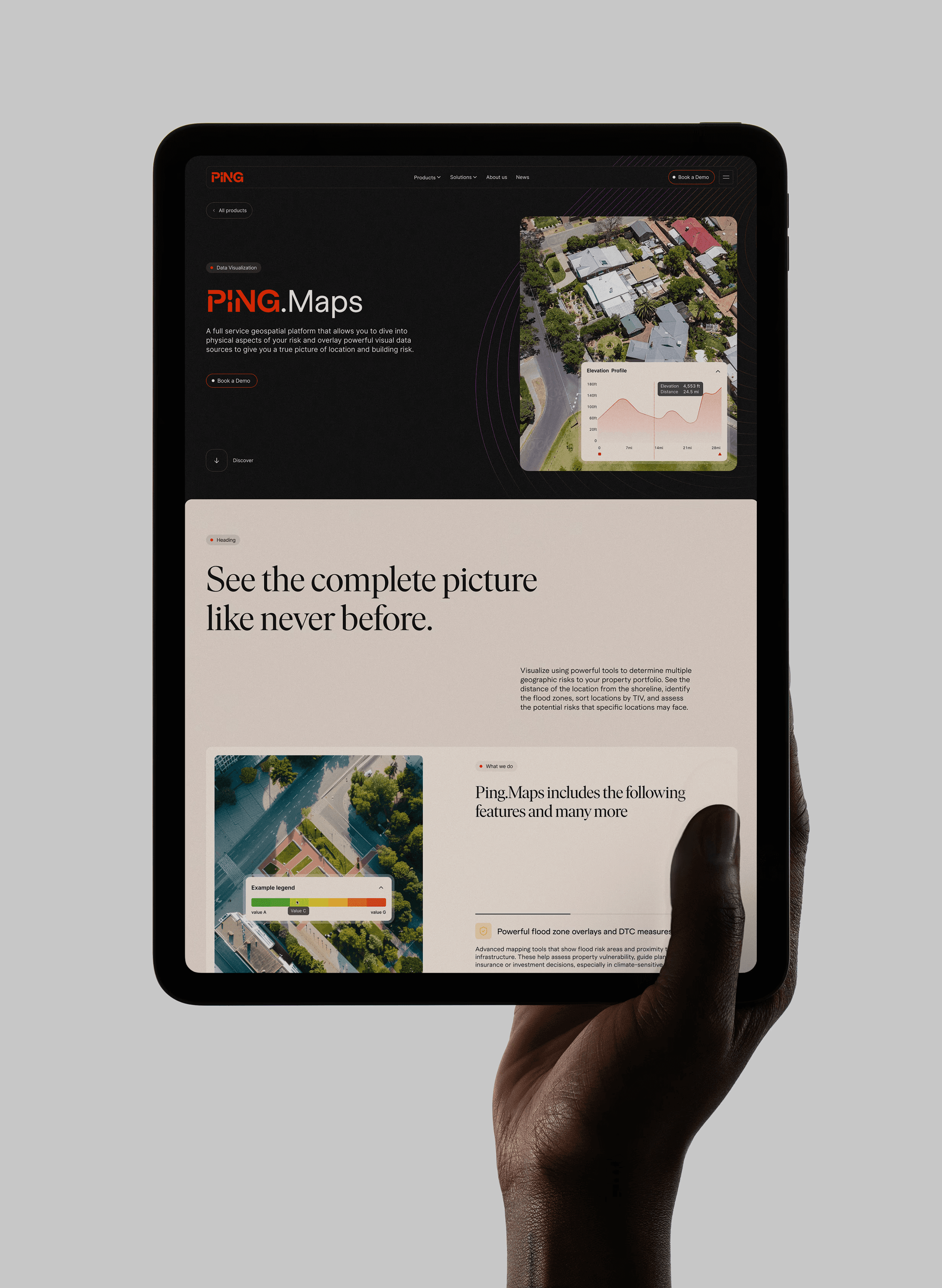
The brand launched with a new website designed by ZeroSixty and developed by Code Resolution. As Ping rolls out new products, expands partnerships, and reintroduces itself to the market, its brand now tells the bigger story it was always meant to tell.
Business results are already starting to show—but more importantly, Ping now walks into every conversation not as a tool provider, but as a driver of industry-wide transformation.
We came into this with an unclear vision and unformed goals. Small Forest helped define both in a way that made them focused and meaningful.
— Scott Stafford, Chief Technology Officer, Ping
Client Partners
Stuart Mercer, Scott Stafford, Joseph Misiti, Corbin Wade, Ellie Mercer
Digital Experience Partners
Thomas Moeller and Kalpesh Rathod, ZeroSixty
Elliott Mangham, Code Resolution
Accolades
The Drum Awards
Best Use of AI
(2023)
W3 Awards Gold
(2023)
International Design Excellence Awards x3
(2020, 2018, 2016)
Project Info
Ping Data Intelligence
Miami, Florida
When Ping came to us they were known primarily as a tool for underwriters. But they had developed something far more potent: a modular, AI-powered data platform that could clean, process, and structure exposure data in seconds. But their brand still told a small story, one rooted in features and functions for a narrow slice of the market.
They needed more than a new look. They needed to reposition themselves as something larger.
We began by immersing ourselves into the world of Ping’s users: brokers, underwriters, MGAs, and carriers across the U.S. and U.K. These were highly credentialed professionals, often leading digital transformation initiatives with caution, not zeal. What they wanted wasn’t disruption—it was clarity, speed, and confidence in a world overwhelmed by data.
We mapped their frustrations. For brokers, it was the inefficiency of legacy workflows. For underwriters, the noise of unstructured data. What united them was a shared desire: to work smarter and faster without disturbing workflows.
Next, we audited the competitive landscape. Using our custom-built GPT, we leveraged AI to analyze the InsurTech 100, the world's 100 most innovative insurance technology companies. What we found was a field of visual and verbal familiarity: formulaic sans-serif logos, safe blues and greens, vague talk of “intelligence” and “solutions.” It was clear that if Ping was going to rise above, it needed to look and sound like a company building something bigger.
Through research and collaborative workshops, a single core truth emerged that drove the strategy:
The promise of innovation in a single leap is scary and threatens disruption to existing workflows. Realistic innovation builds momentum through steady, manageable steps. Ping’s modular solutions collectively form the new infrastructure that enables meaningful innovation at any stage of a client's transformation.
Rather than retrofit the brand around disconnected products, we positioned Ping as something fundamentally different: the infrastructure that makes innovation possible. Not the shiny new thing, but the essential platform underneath it all.
We called it "Infrastructure for Innovation."
On this foundational brand idea, we crafted a narrative that invited the entire industry into a shared future. While others were building faster cars, Ping was laying the highway. It wasn’t just about making a few processes work better, it was about making a better industry possible.
This message of empowerment—of being the force behind transformation, not the face of it—resonated deeply with Ping’s team. It clarified not only how they saw themselves, but how they spoke to their customers.
Visually, we reflected this strategy with a system that communicates structured modularity. The Ping logo embodies constant motion—always building, always evolving.
It represents the very essence of Ping’s promise:
• To create structure where there was none.
• To turn scattered data into a powerful infrastructure.
• To move the insurance industry forward, piece by piece, solution by solution.
We chose Macan by Tightype as the primary typeface for its clarity, impact and ability to carry the feeling of the logo throughout the system. We added the gravitas and sophistication Ping's clients expect with Ivar by Letters From Sweden. And we broke from the cool color palettes dominating the category, opting instead for warmth, energy and confidence. Ping could now confidently own a color space others had left unclaimed.
The brand launched with a new website designed by ZeroSixty and developed by Code Resolution. As Ping rolls out new products, expands partnerships, and reintroduces itself to the market, its brand now tells the bigger story it was always meant to tell.
Business results are already starting to show—but more importantly, Ping now walks into every conversation not as a tool provider, but as a driver of industry-wide transformation.
Client Partners
Stuart Mercer, Scott Stafford, Joseph Misiti, Corbin Wade, Ellie Mercer
Digital Experience Partners
Thomas Moeller and Kalpesh Rathod, ZeroSixty
Elliott Mangham, Code Resolution
We came into this with an unclear vision and unformed goals. Small Forest helped define both in a way that made them focused and meaningful.
— Scott Stafford, Chief Technology Officer, Ping


