Sagesse
Brand identity for a strategic communications consultancy.
Brand identity for a strategic communications consultancy.
Brand identity for a strategic communications consultancy.
French for wisdom, Sagesse (sah-zhess) stands out by leaning in to the founder's origin story. It is inspired by the timeless elegance of Audrey Hepburn, French film posters and mid-century type specimens.
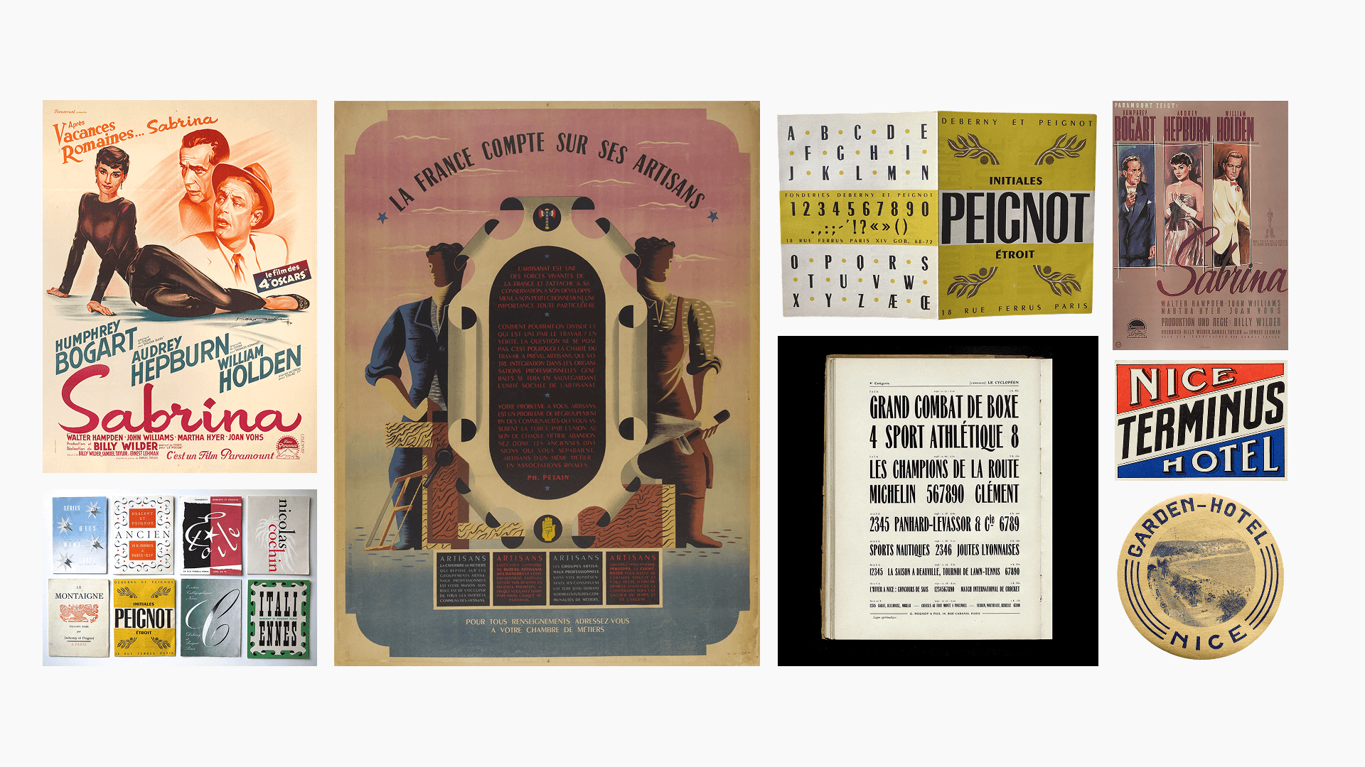
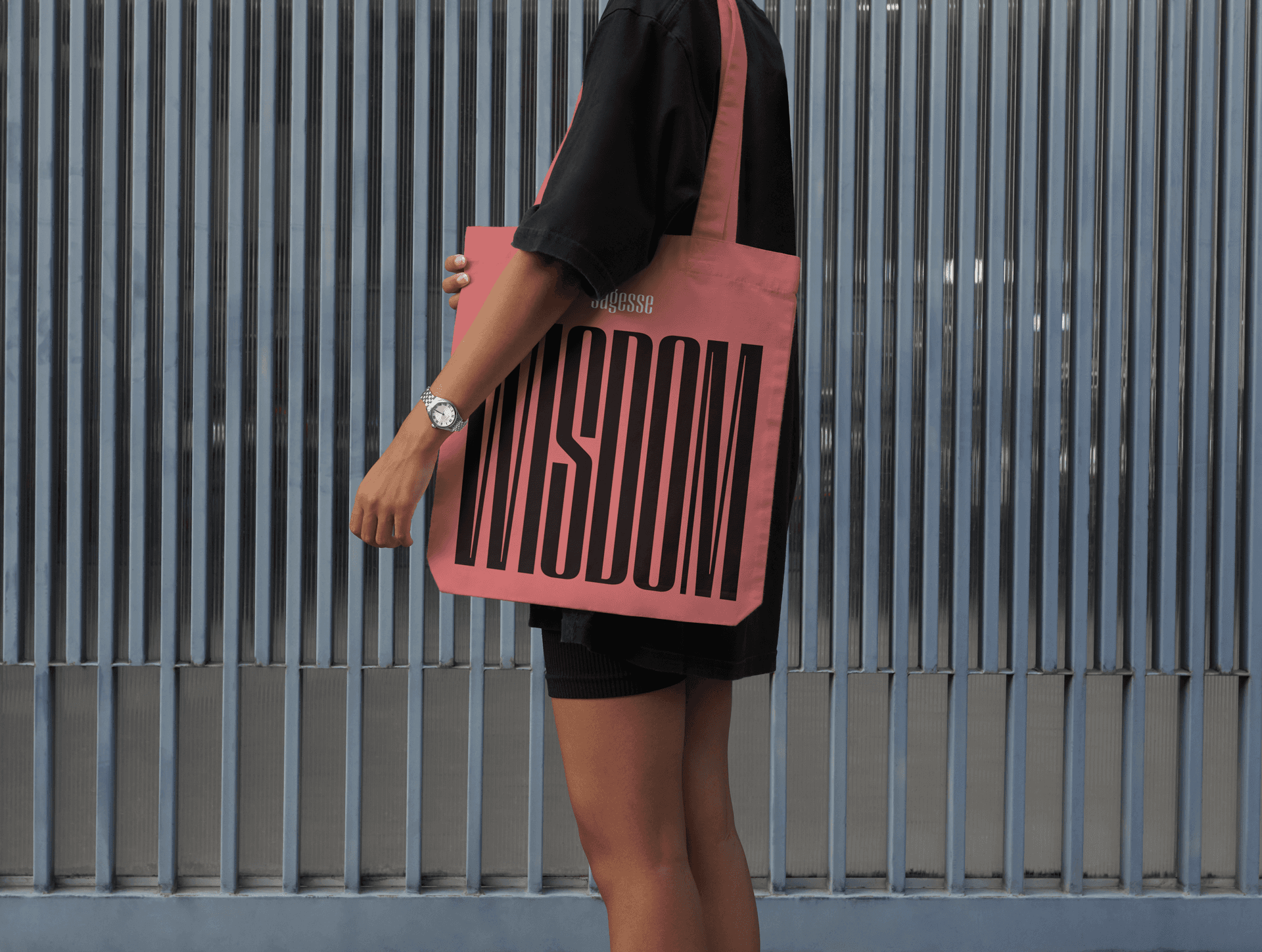
The identity is a nod to the Art Deco era of glamour and technological progress. It blends vintage bravado with a modern, chic and elegant style.
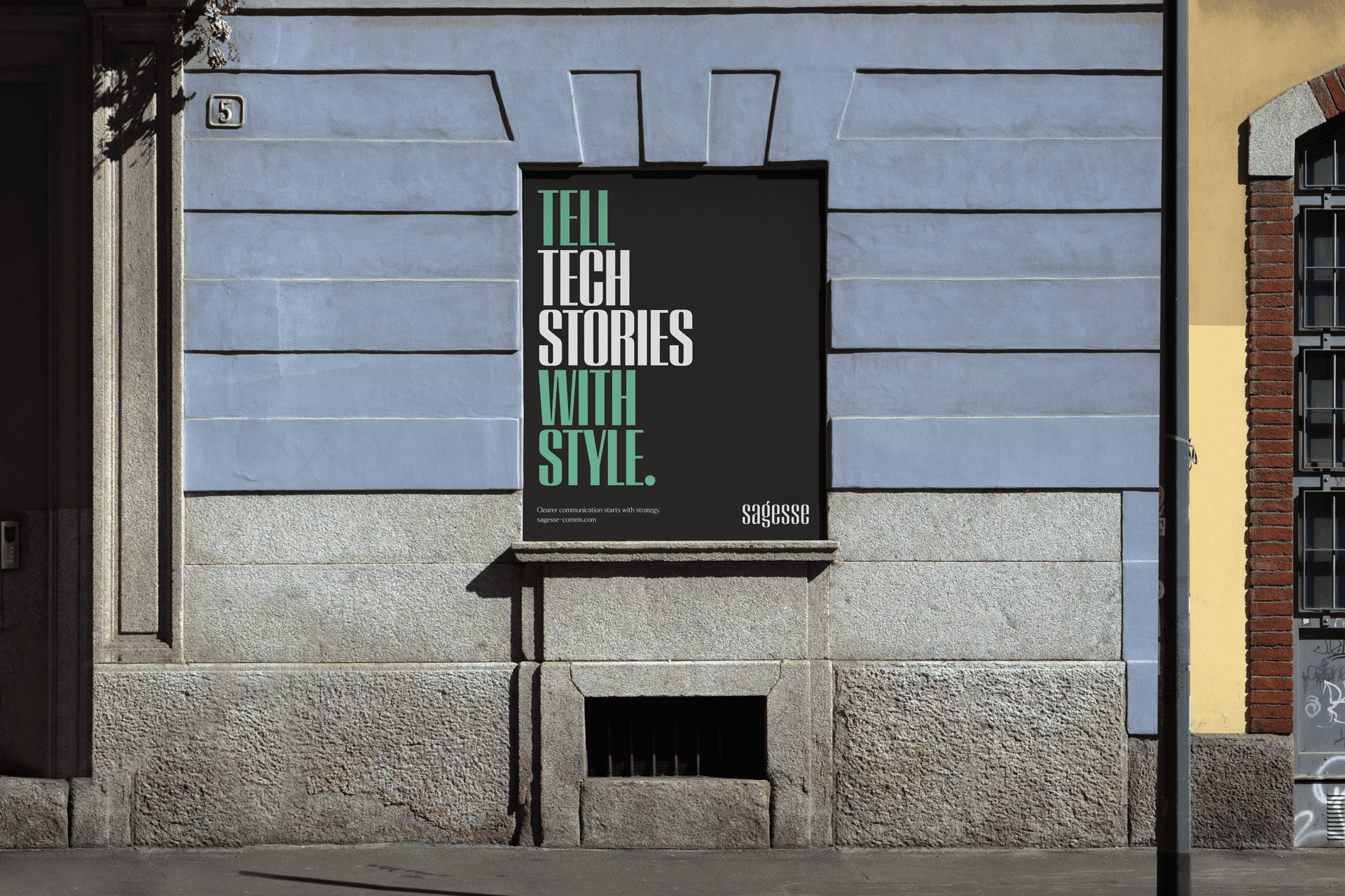
The system conveys a smart and confident brand that tells tech stories with style.

Project Info
Sagesse
San Francisco, California
When our client at Sagesse (sah-zhess) set out to launch her independent communications consultancy, she wasn’t looking to build a typical small business brand. It needed to feel bespoke, confident, and instantly credible. The challenge wasn’t just to create a logo, but to articulate a presence: something that could carry the founder’s decades of experience and unmistakable personal style into a new, high-trust category of strategic advisors.
From the outset, the project was defined not by category clichés, but by deep listening. We discovered her story held something richer: a unique blend of European grace, Silicon Valley credibility, and sharp strategic insight.
In particular, we uncovered a deep connection to the 1954 film Sabrina, starring Audrey Hepburn. Her balance of wit, elegance, and transformation became the perfect metaphor for the brand. We saw the film character and the business as an ace card, elegant and possessing game-changing influence. For Sagesse, it became the central brand idea: Ace up your sleeve. This isn’t just another consultancy; its the strategic wildcard that C-suite leaders would keep close and call upon when the stakes were highest.
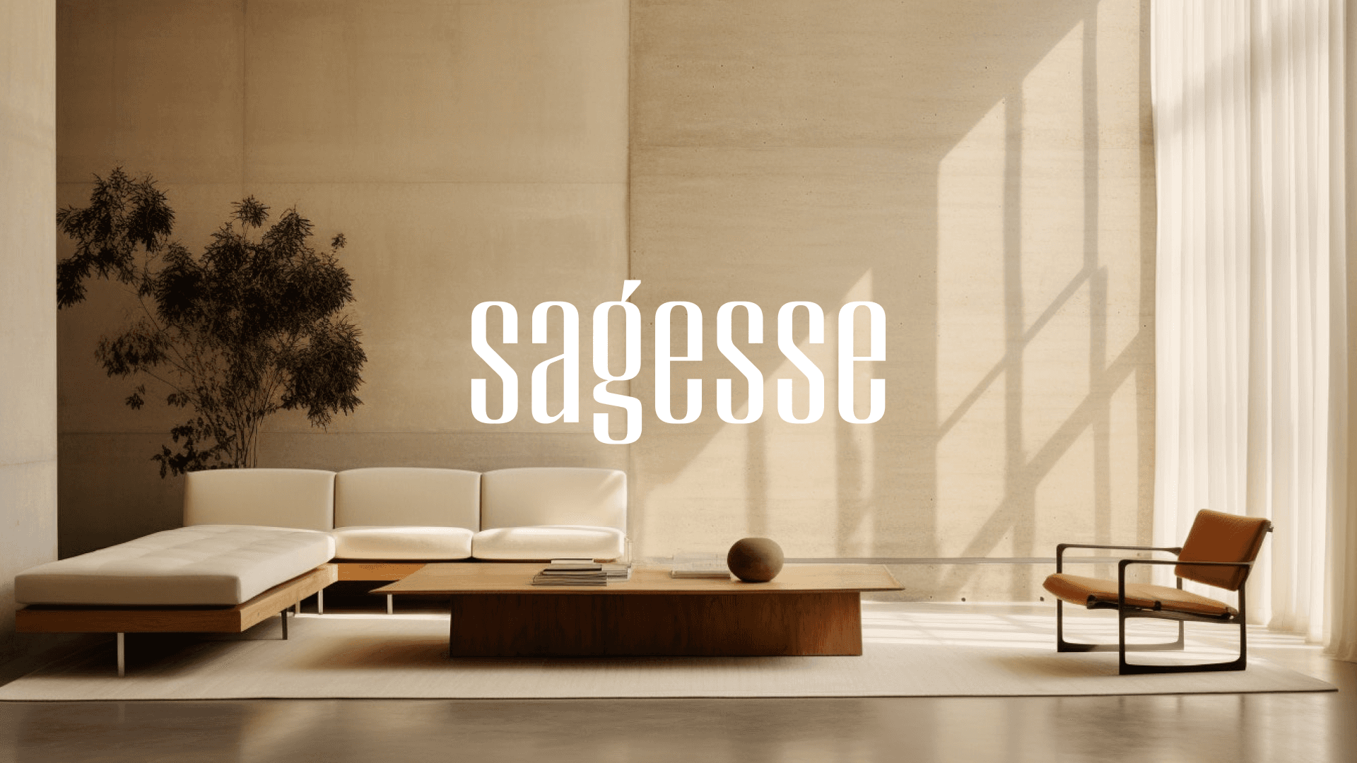
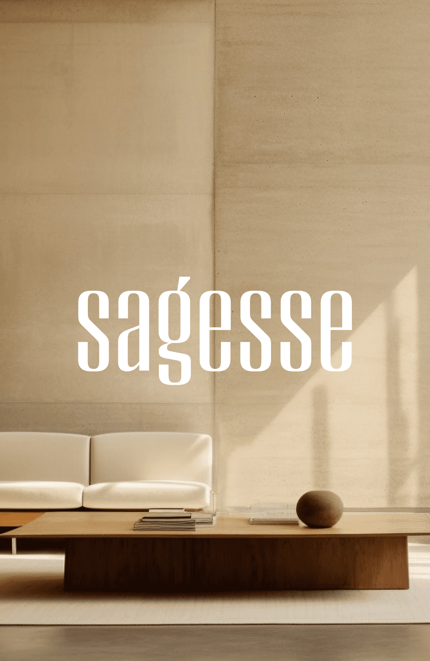
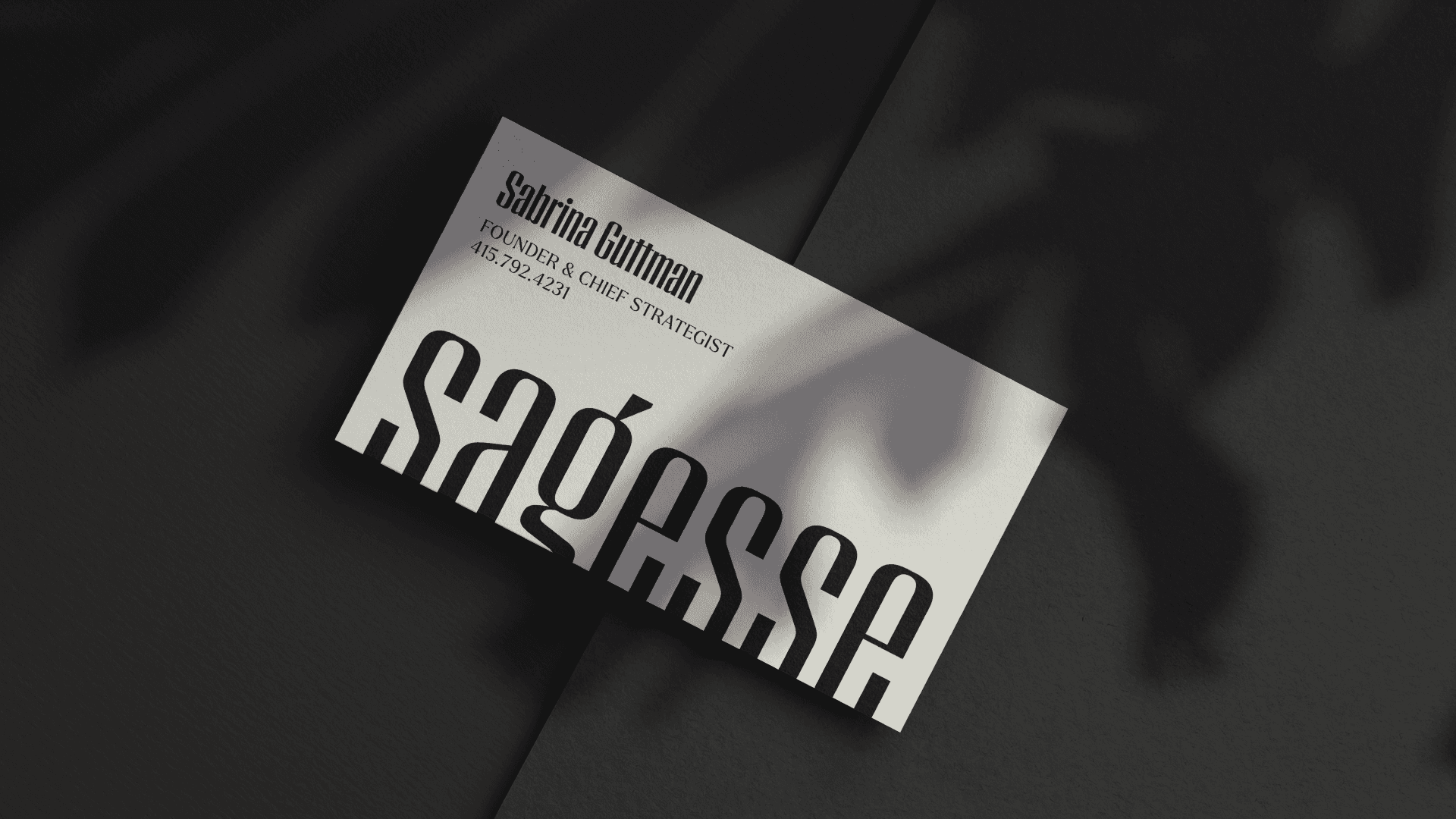
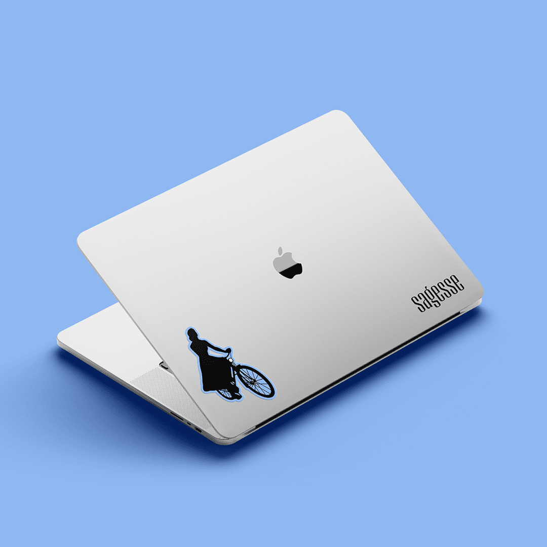
Inspired by the film’s mid-century aesthetics, the visual identity carries a quiet confidence. The logotype is composed from Peristyle, a modern, high-contrast sans-serif by Hoefler & Co. And the design system is supported by Larken from Ellen Luff Type, blending tones of high fashion editorial and institutional credibility. "The Audrey” is an emblem of Sabrina on her bicycle, a timeless silhouette of motion, joy, and elegance.
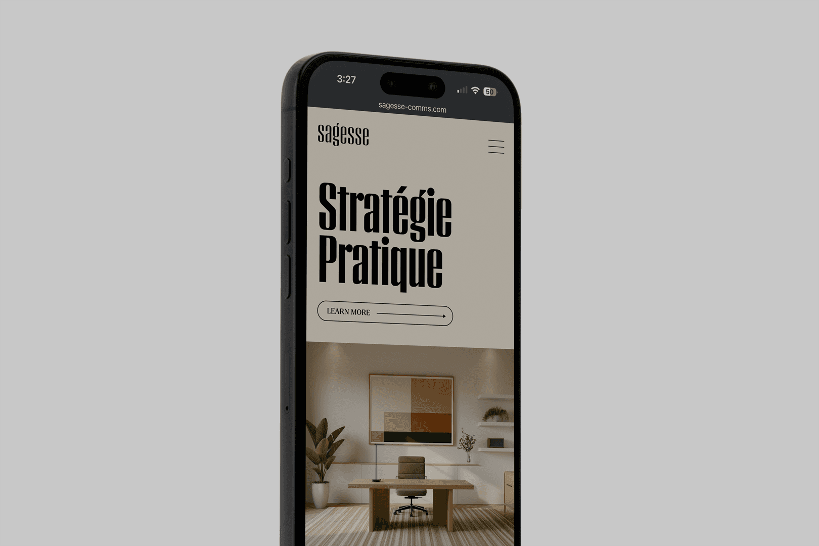
The color palette evokes subtlety and maturity, allowing the typography and messaging to be center stage. Together they frame the offering as "bespoke communication strategies for tech leaders" with a tone that is smart, measured, and assured.
In a world where many B2B brands default to noise, Sagesse stands apart by embracing elegance as a competitive advantage. There’s no hard sell here. Just expertise, style, and a clear sense of purpose. By listening closely and looking beyond category norms, we unearthed a narrative and aesthetic that no competitor could replicate. The result is a brand that feels timeless, authentic, and entirely unique to the woman behind it.
Client Partner
Sabrina Guttman
Project Info
Sagesse
San Francisco, California
When our client at Sagesse (sah-zhess) set out to launch her independent communications consultancy, she wasn’t looking to build a typical small business brand. It needed to feel bespoke, confident, and instantly credible. The challenge wasn’t just to create a logo, but to articulate a presence: something that could carry the founder’s decades of experience and unmistakable personal style into a new, high-trust category of strategic advisors.
From the outset, the project was defined not by category clichés, but by deep listening. We discovered her story held something richer: a unique blend of European grace, Silicon Valley credibility, and sharp strategic insight.
In particular, we uncovered a deep connection to the 1954 film Sabrina, starring Audrey Hepburn. Her balance of wit, elegance, and transformation became the perfect metaphor for the brand. We saw the film character and the business as an ace card, elegant and possessing game-changing influence. For Sagesse, it became the central brand idea: Ace up your sleeve. This isn’t just another consultancy; its the strategic wildcard that C-suite leaders would keep close and call upon when the stakes were highest.
Inspired by the film’s mid-century aesthetics, the visual identity carries a quiet confidence. The logotype is composed from Peristyle, a modern, high-contrast sans-serif by Hoefler & Co. And the design system is supported by Larken from Ellen Luff Type, blending tones of high fashion editorial and institutional credibility. "The Audrey” is an emblem of Sabrina on her bicycle, a timeless silhouette of motion, joy, and elegance.
The color palette evokes subtlety and maturity, allowing the typography and messaging to be center stage. Together they frame the offering as "bespoke communication strategies for tech leaders" with a tone that is smart, measured, and assured.
In a world where many B2B brands default to noise, Sagesse stands apart by embracing elegance as a competitive advantage. There’s no hard sell here. Just expertise, style, and a clear sense of purpose. By listening closely and looking beyond category norms, we unearthed a narrative and aesthetic that no competitor could replicate. The result is a brand that feels timeless, authentic, and entirely unique to the woman behind it.
Client Partner
Sabrina Guttman


